For 23 years, Pantone’s Color of the Year has influenced product development and purchasing decisions in multiple industries, including fashion, home furnishings, and industrial design, as well as product packaging and graphic design.
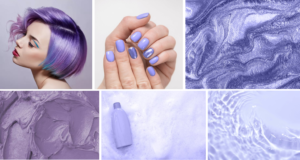
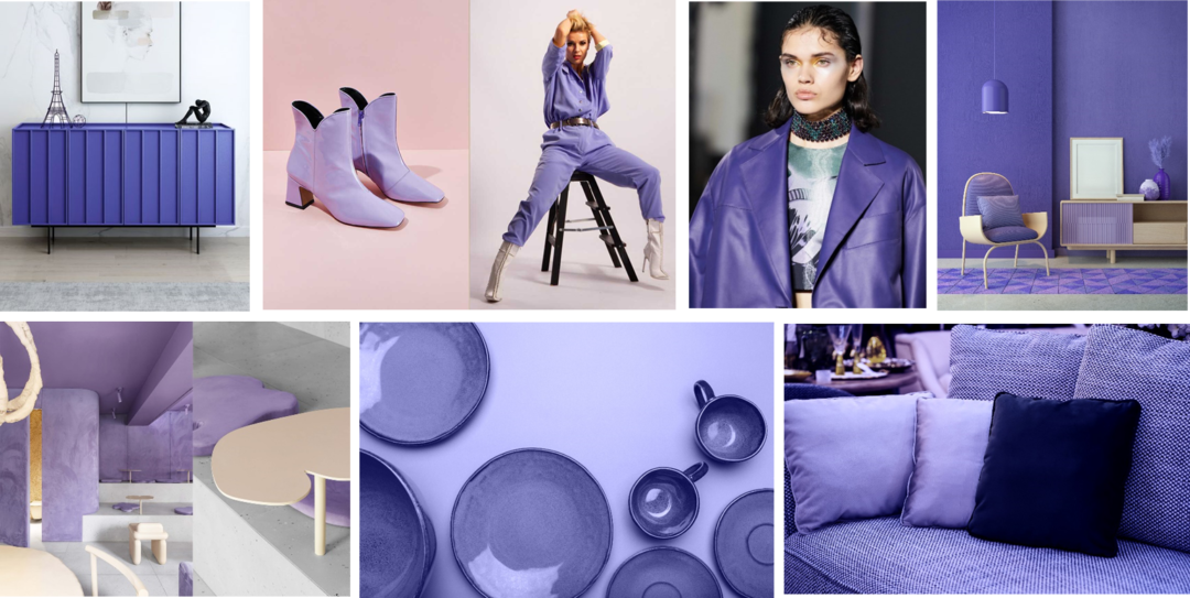
VERY PERI
PRESENTATION OF THE COLOR OF THE YEAR PANTONE® 2022
We are living in transformative times. Very Peri is a symbol of the global zeitgeist of the moment and the transition we are going through.
As we emerge from an intense period of isolation, our notions and standards are changing, and our physical and digital lives have merged in new ways.
Digital design helps us to stretch the limits of reality, opening the door to a dynamic virtual world where we can explore and create new color possibilities.
With trends in gaming, the expanding popularity of the metaverse and rising artistic community in the digital space Very Peri illustrates the fusion of modern life and how color trends in the digital world are being manifested in the physical world and vice versa.
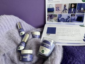
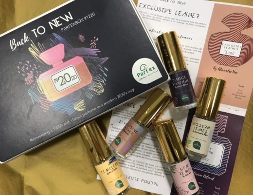
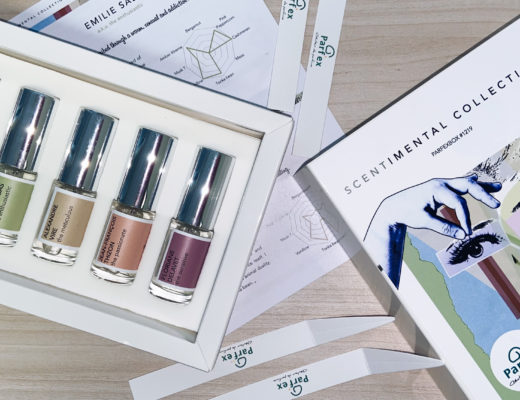
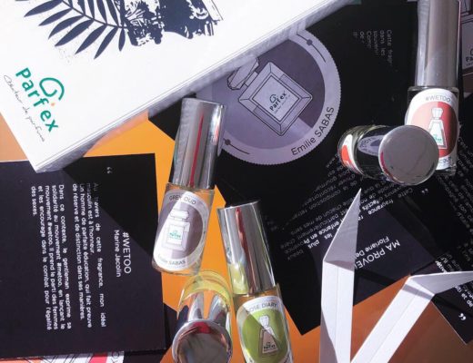
A Periwinkle blue hue with violet-red undertones, this color is described as reflecting a joyous attitude and inspiring the desire to exPeriment with imaginative expression and courageous creativity… that’s perfect timing, we gave carte blanche to our perfumers to create their own olfactory interpretation of Very Peri !
